Major League Soccer (MLS) has achieved several milestones over the past two years, including the introduction of new teams and the opening of new soccer-specific stadiums. MLS felt a new look was in order that gave a “proper representation of the league we are and want to become,” Howard Handler, chief marketing officer, Major League Soccer, said when the new look was unveiled last fall.
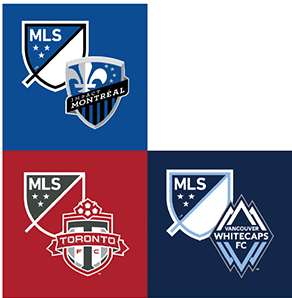
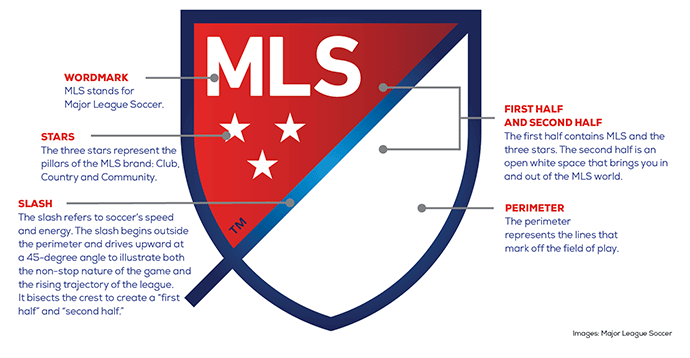
The colours of the brand identity pay homage to the nations MLS represents—Canada and the United States—while the design is intended to say “soccer” without the literal ball and cleat of its predecessor. The flexible nature of the brand will also allow clubs to adopt the league crest in their own unique colour schemes.
The mark is designed to work across mobile and digital environments as well as in broadcasts, advertisements and on the sleeves of jerseys and match balls.
The development process was driven in-house with input from the following agencies: Gigunda Group, Athletics LLC and Berliner Benson.


