
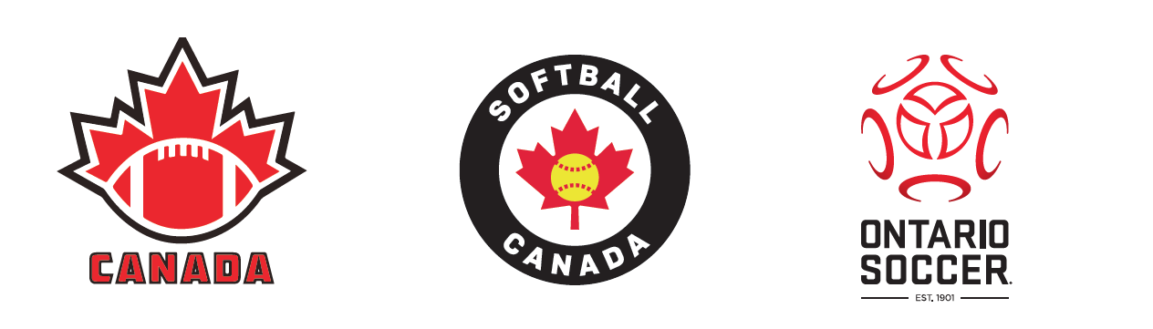
Football Canada
Football Canada’s cleaner, more contemporary logo is inspired by three earlier versions plus the one used prior to 1984 when the group was called the Canadian Amateur Football Association.
The Goal: To bring the look into the 21st century and better integrate with digital communications across many platforms.
The new logo “represents local, provincial and national amateur football across Canada… working together to grow this great game which unites our nation,” says Kim Wudrick, president, Football Canada.
The Breakdown
The maple leaf’s three segments stand for local, provincial and national levels.
Five laces on the ball represent the brand’s five pillars: Development, Inclusiveness, Safety, Events and Canadian.
The arc of the base not only mimics
the flight of a football, but also suggests the distance between any two points across the country that are connected through football.
Softball Canada
With softball being reintroduced in the 2020 Tokyo Olympics and Canada riding high in world competition, Softball Canada has revamped its visual identity.
The Goal: To refresh the look and keep the brand consistent at all levels of play. “The timing was right: we celebrated our 50th anniversary in 2015; the previous logo was designed for our 25th anniversary,” says Gilles LeBlanc, manager, marketing and communications, Softball Canada.
The Breakdown
A streamlined new emblem brings the maple leaf and ball to the forefront.
The colour reflects the introduction of yellow balls between 2005 and 2007.
Since “balle molle” has passed out of general use, the emblem is bilingual.
Ontario Soccer
The Ontario Soccer Association has rebranded as Ontario Soccer with a complete image overhaul, including visual identity. The rebrand “is one of many enhancements coming to ultimately improve the participant experience in our great game,” says Ron Smale, president, Ontario Soccer.
The Goal: “We needed to be more relevant and current,” says Ontario Soccer executive director Johnny Misley. “We wanted to say ‘modern,’ ‘soccer’ and ‘Ontario,’ and to respect our rich history.”
The Breakdown
Five outer rings describe a soccer
ball and represent Ontario Soccer’s five key stakeholders: players, coaches, match officials, volunteers and administrators.
Three inner “islands” stand for “Play, Inspire, Unite.”
The Ontario trillium is created by white space in the centre.
The colours align with Canada Soccer, Team Ontario and Canada’s flag.
Over the next few years, the text will be dropped and the logo will stand alone.